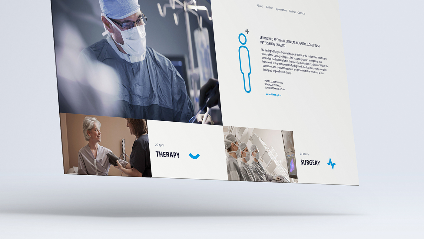
Leningrad Regional Clinical Hospital
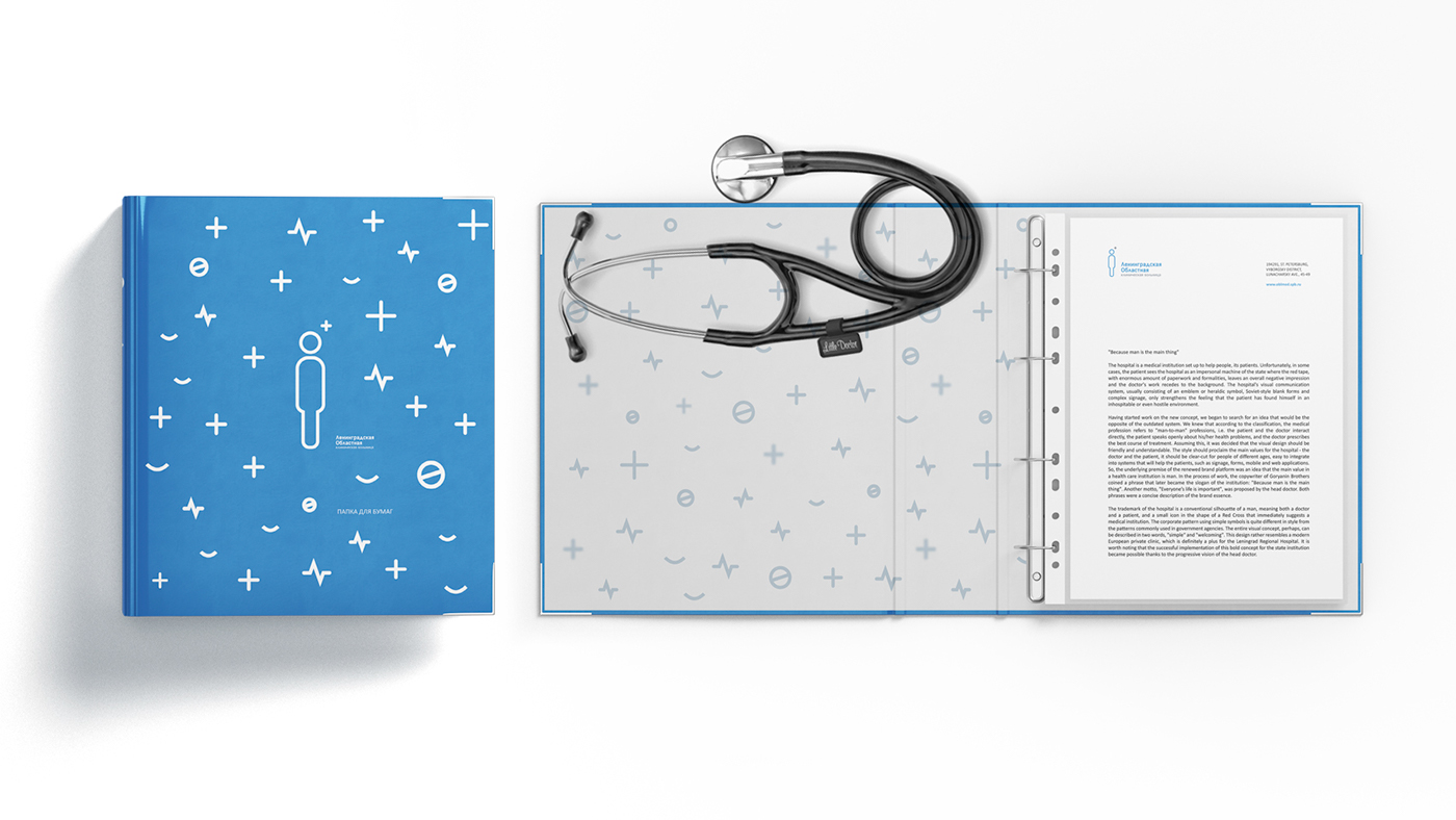
"Because man is the main thing"
The hospital is a medical institution set up to help people, its patients. Unfortunately, in some cases, the patient sees the hospital as an impersonal machine of the state where the red tape, with enormous amount of paperwork and formalities, leaves an overall negative impression and the doctor's work recedes to the background. The hospital's visual communication system, usually consisting of an emblem or heraldic symbol, Soviet-style blank forms and complex signage, only strengthens the feeling that the patient has found himself in an inhospitable or even hostile environment.
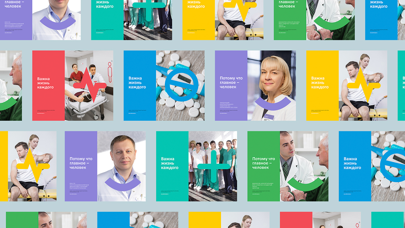
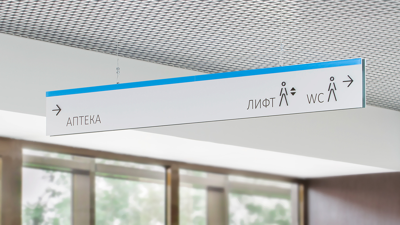
Having started work on the new concept, we began to search for an idea that would be the opposite of the outdated system. We knew that according to the classification, the medical profession refers to "man-to-man" professions, i.e. the patient and the doctor interact directly, the patient speaks openly about his/her health problems, and the doctor prescribes the best course of treatment. Assuming this, it was decided that the visual design should be friendly and understandable. The style should proclaim the main values for the hospital - the doctor and the patient, it should be clear-cut for people of different ages, easy to integrate into systems that will help the patients, such as signage, forms, mobile and web applications. So, the underlying premise of the renewed brand platform was an idea that the main value in a health care institution is man. In the process of work, the copywriter of Goryanin Brothers coined a phrase that later became the slogan of the institution: "Because man is the main thing". Another motto, "Everyone’s life is important", was proposed by the head doctor. Both phrases were a concise description of the brand essence.
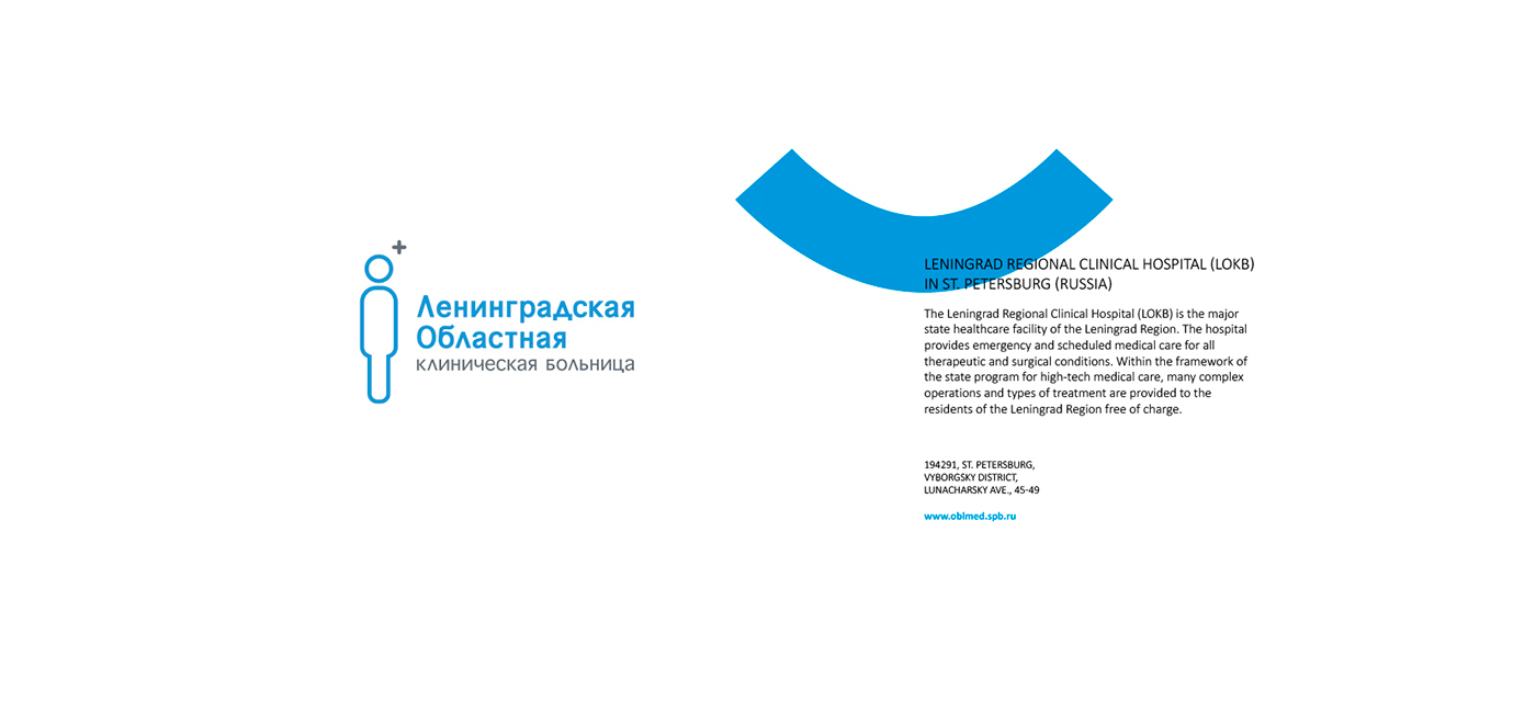
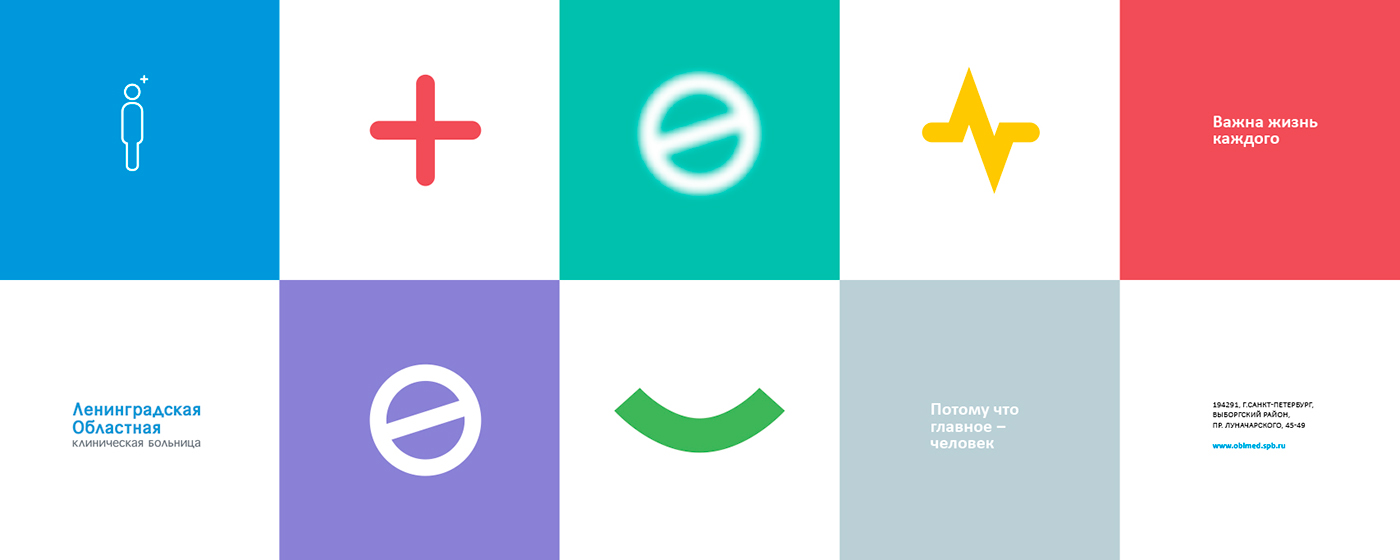
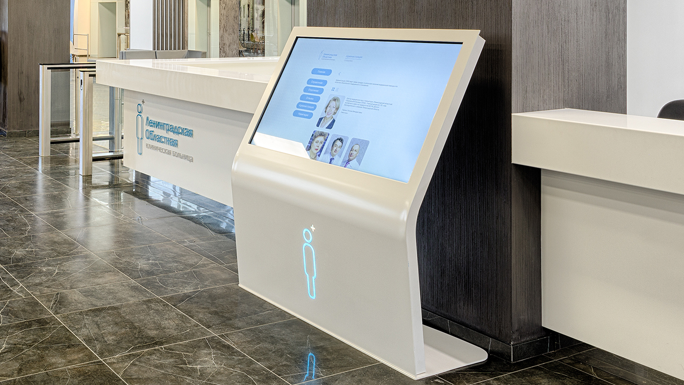
The trademark of the hospital is a conventional silhouette of a man, meaning both a doctor and a patient, and a small icon in the shape of a Red Cross that immediately suggests a medical institution. The corporate pattern using simple symbols is quite different in style from the patterns commonly used in government agencies. The entire visual concept, perhaps, can be described in two words, "simple" and "welcoming". This design rather resembles a modern European private clinic, which is definitely a plus for the Leningrad Regional Hospital. It is worth noting that the successful implementation of this bold concept for the state institution became possible thanks to the progressive vision of the head doctor.
The trademark of the hospital is a conventional silhouette of a man, meaning both a doctor and a patient, and a small icon in the shape of a Red Cross that immediately suggests a medical institution. The corporate pattern using simple symbols is quite different in style from the patterns commonly used in government agencies. The entire visual concept, perhaps, can be described in two words, "simple" and "welcoming". This design rather resembles a modern European private clinic, which is definitely a plus for the Leningrad Regional Hospital. It is worth noting that the successful implementation of this bold concept for the state institution became possible thanks to the progressive vision of the head doctor.
Created logo:
2016 March